
The Fresh Organics is a chain of Fresh Organics store as name suggest. We sell fresh organic and exotic fruits and vegetables. We have tie-ups with certified organic farmers who are equally passionate about organic farming. Everything we gets is directly from these our standard farmers who passes all industry-standard quality checks for fresh organic produce.
Fresh Organics has gained a popularity over the period for its freshness and good quality of produce. Hence, there is a significant rise in the demand for fresh and organic produce in metro cities. In recent times, they have been receiving requests from the customers for shipping and delivery at the doorstep. Hence, we decided to provide a platform where one can purchase online. Also, by taking this step we can include orders for nationwide shipping and less than 1 hour express delivery . Now everyone can shop fresh and organic produce with ease and anywhere nationwide.
Fresh Organics – Case Study
UI/UX, e-Commerce Website Design & Development

The Fresh Organics is a chain of fruits store in India. They sell fresh organic and exotic fruits. They have tie-ups with certified organic farmers who are equally passionate about organic farming. Fruit Basket gets all the fruits directly from these farmers. Also, they have industry-standard quality checks for organic fruit procurement.
Fruit Basket has gained a lot of customers for all their good quality fruits in less time, as the people in India are getting aware of their health, eating habits, and good quality food. Hence, there is a significant rise in the demand for organic produce in metro cities across India. In recent times, they have been receiving requests from the customers for parcels and delivery at the doorstep. Hence, they decided to provide a platform where one can purchase online. Also, by taking this step they can include orders from other nearby locations as well. People can buy fresh fruits as well as exotic fruits and get them delivered to their homes at an affordable cost.
Design Process
1. Define
- PROBLEM STATEMENT
How we can promote and help the consumers to get Fresh Organics online with ease?
- By tracking customers geolocation and push them to the nearest available store for pickup or delivery
- By providing easy search and filters to find the products the customers is looking
- Promoting Fresh Organic awareness and its benefits
- SEO, Loyalty points, Daily offers, Promo coupons, Text email marketing, Google Ads, social media campaigns, press
- PROJECT VISION
“To design an online platform that will be user friendly and provide hassle free experience to the customer to place the order as per their needs”
- PROJECT KPI’s
Fresh Organics is a new start up with the online presence and so is new to the market. To measure the online performance we need to track the business
- Trends in number of orders on daily weekly & monthly basis
- Customer satisfaction and short surveys
- Sells target analysis
2. Research
- STAGE 1
We all know Fresh Organic produce are free of chemicals and pesticides and have benefits but to understand the online customers in better we conducted a secondary research to determine the demographics of the potential consumers – their needs and expectations; analyze the scope of the Fresh Organic produce market; assess competitor’s market positioning and analyze their online presence pros and cons; identify pain points of consumers and what difficulties they face when shopping online.
View in-detail secondary research.
- KEY TAKEAWAYS FROM THE RESEARCH
There is a high demand in the Indian market for affordable organic fruits. Due to the associated high-cost, as of now, only the high-middle income people are the consumers. And only a few suppliers are there.
The organic products market in India has been growing at a CAGR of 25%.
Certification is issued by the Government of India for organically produced foods. The FSSAI introduced the Jaivik Bharat logo to help customers identify authentic organic food.
- ANALYZING COMPETITOR
Before working on any product, it is important to know where your business stands in the market. Exploring and studying everything related to our new product helps us in knowing the product, market, and goals more clearly. We searched for related websites and began monitoring the features, functions, and experiences and the outcome we have got is the report of the competitive analysis shown below.
- COMPETITOR ANALYSIS
Want to find more about the existing market competitors? Here is the link.
- FEATURE ROADMAP
Once we are done with analyzing the competitors, we are ready to move ahead and decide the features our website would be providing. And simultaneously find its building cost and impact. The time required, technology, skills, manpower, cost, and impact of the feature are considered in this activity. Time, technology, skills, manpower, and the cost is to be considered one unit called “Building Cost” and impact as the other called “Impact”. A feature roadmap is created by considering the feature and its impact and cost together for gaining insights easily.
Feature Roadmap
View the detailed Feature Roadmap here.
- FEATURE MATRIX
Once we have got the cost and impact, we need to find the focus area and the key features that are to be implemented on the website and prioritize them. In this case study, our main focus is on the purchase journey and its related activities. The feature-matrix becomes important as the implementation cost and impact analysis are evaluated in this and thus we can easily find the things to be implemented.
3. Understanding Users
- UNDERSTANDING USERS
A proper understanding of the target audience is important to create an exceptional product.
Persona to know who we are designing for
We developed a character and added a backstory that looks like the user who is a consumer of organic fruits. We added goals, motivations, needs, and frustrations as a target user to give the person a real-life experience.
- PERSONA
Understanding in-depth With Empathy Map
Once the persona is ready, understanding their emotions in-depth report is important. An empathy map is built to illustrate the customer’s day to day activities, thoughts, gains, pains, etc. It made us understand them clearly.
4. Project Goals
A project becomes a success when both the business and the consumer are happy and satisfied. Hence building a profitable project model becomes important. We saw what our project goals are. Moving on, we considered the business goals along with the user goals for building the model. Later on mutual goals were identified which gave us a clear path to move ahead. Working on project goals gave us the opportunity to gain insights into the User perspective, their gain points, and pains.
- Information Architecture
The next step is Information Architecture which is the most critical phase for any product’s journey. As per the mutual goals identified one of the most important parts was to provide effortless navigation which would eventually create the easiest and pleasant experience for them.
To make this possible it was necessary to include building an Information Architecture as it is the foundation of developing a sitemap. This IA is made for only the purchase journey and the features enlisted as priority 1 and priority 2 are considered.
7. User Testing
LOW FIDELITY PAPER SKETCHES
Once the IA is formed, we are ready to start designing. We started with paper and a pencil and tried to design multiple solutions through paper sketch iterations. It gave us a quick check for what is working and what is not, so we could design a better solution.
Paper Sketches
We developed a character and added a backstory that looks like the user who is a consumer of organic fruits. We added goals, motivations, needs, and frustrations as a target user to give the person a real-life experience.
Tool-based Wireframes
Finally, after many iterations of paper sketches, a low fidelity wireframe and a working prototype were designed using Figma to define the visual form on the screen, presentation, and arrangements of all the elements. The interactive prototype worked like an actual application and so the users were able to relate to it as an actual product
Mobile Wireframes
As we all know that in today’s world, people are always carry their mobile phones and make good use of it. And so we decided to create a responsive website for the mobile as well!
Mobile Wireframes
As we all know that in today’s world, people are always carry their mobile phones and make good use of it. And so we decided to create a responsive website for the mobile as well!
Paper Sketches
Here is the link to view all the paper sketches.
Tool-based Wireframes
Finally, after many iterations of paper sketches, a low fidelity wireframe and a working prototype were designed using Figma to define the visual form on the screen, presentation, and arrangements of all the elements. The interactive prototype worked like an actual application and so the users were able to relate to it as an actual product.
Desktop Wireframes
View all the desktop wireframes
As we all know that in today’s world, people are always carry their mobile phones and make good use of it. And so we decided to create a responsive website for the mobile as well!
Mobile Wireframes
View all the mobile wireframes
7. User Testing
- UNDERSTANDING USER
We designed a usability test plan and conducted the usability testing of the wireframe prototype to validate the application design. Test scenarios were given to the participants and their behavior was observed. Participants were encouraged to speak up whatever came to their mind while using the prototype. Feedbacks received from the participants were analyzed, which gave us more clarity for the application design system and the user’s thought process.
Here is the summary of findings from the Usability Test
From the usability testing, it can be concluded that the prototype is a success, with respect to the user purchase workflows. We have created an observation sheet for the same. It has helped us to discover some issues in the components which need to be fixed for better usability. A few of them are listed below.
Find the detailed observation sheet here.
At the checkout page, the deliver here option needed to get the prime attention hence it was changed from secondary to primary CTA.
A new CTA — Proceed to checkout was added once the User has moved any item to the cart so that he knows what action he has performed and what to do next to complete the purchase journey.
Corrections done as per usability testing results



Mobile first!
An Initial Approach To Start An UI/UX phase
In the analysis phase, we had already seen that users with mobile devices far outnumbered users browsing on a computer. As a result we only created a version adapted to computer screen use after we had fully developed the mobile version solution and ensured that it was user-friendly enough and easy to understand for users.
We emphasize on product search and filtering solutions which prioritizes the importane of navigation solution and the logic of grouping products, each product can be searched in a number of ways. New customer of the store or not easy navigation flow and smooth and fast payment process are the key factors of the project.


Style & Imagery

#FF2121

#F41F96

#2E2545

#ff7221

#7272FF
Aa
Poppins Semibold 32pt
Poppins Regular 24pt
Poppins Regular 16pt
Poppins Bold 14pt
Vestibulum ante ipsum primis in faucibus orci luctus et ultrices posuere cubilia Curae; Donec velit neque, auctor sit amet aliquam vel, ullamcorper sit amet ligula.


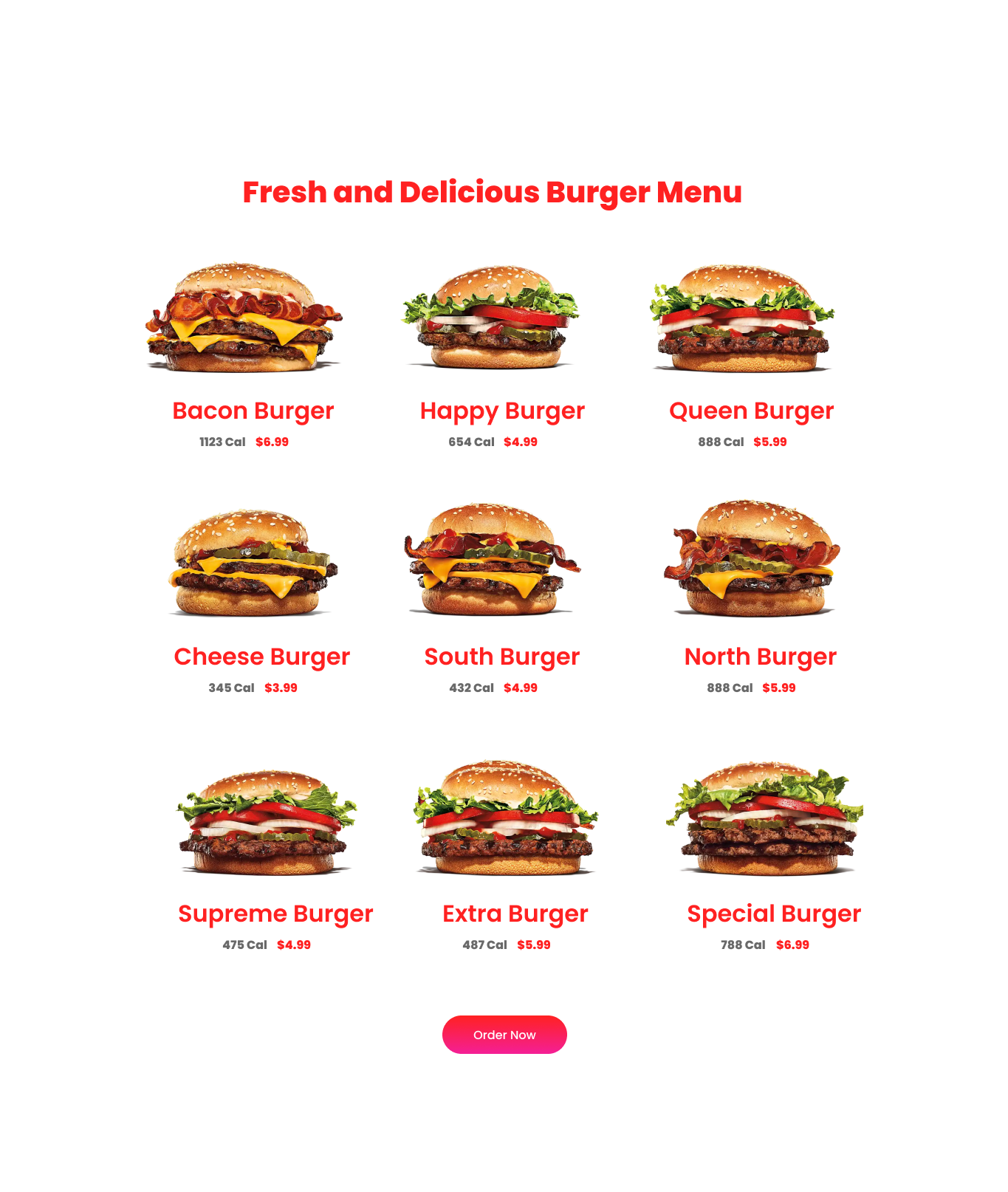
UI Blocks
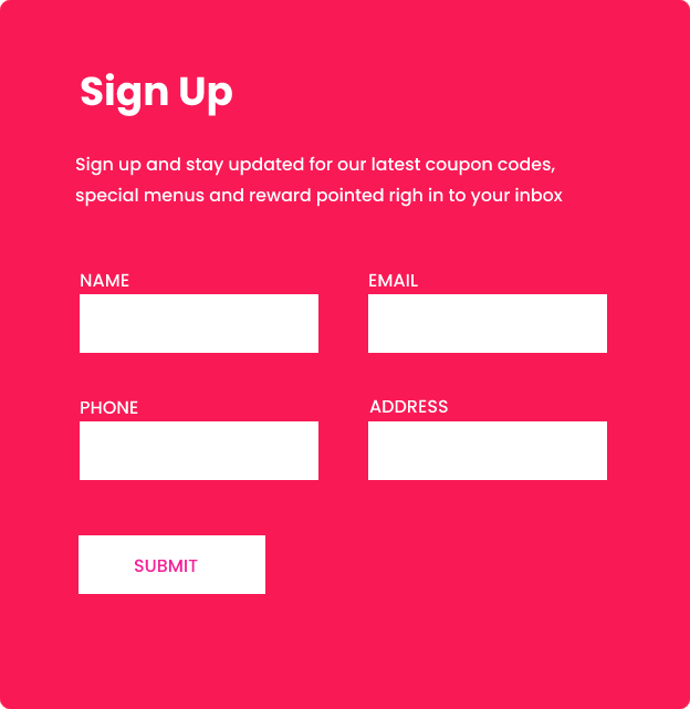
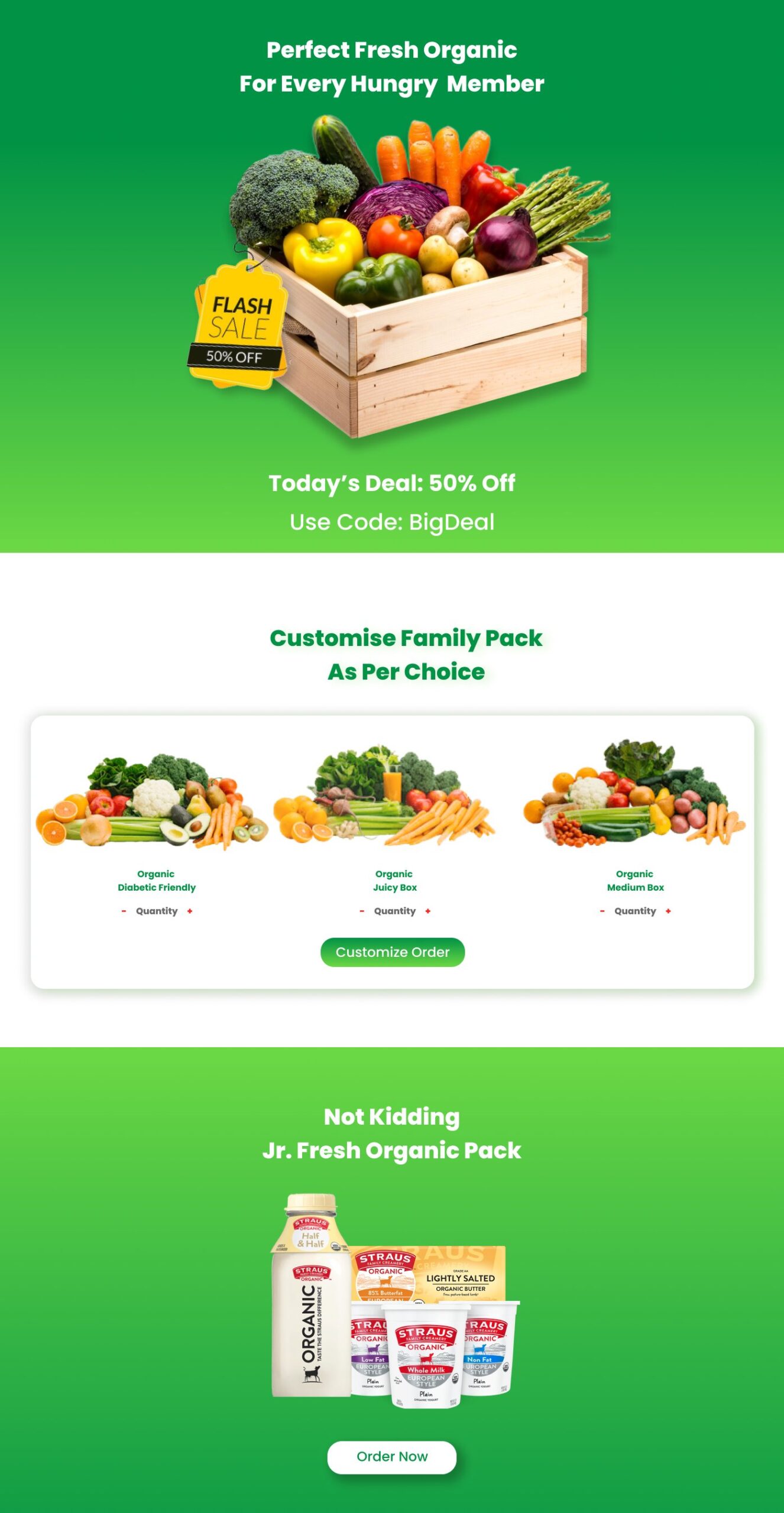
Main Pages
